


THE IDEA
What if we brought the sun back in a waking dream? Just to find again that blue hour, that suspended moment when our eyes hesitate between the softness of the sea before us and the sun, still burning for a few last seconds, its rays vanishing just before dipping below the horizon.
WHAT I WANT TO EXPRESS
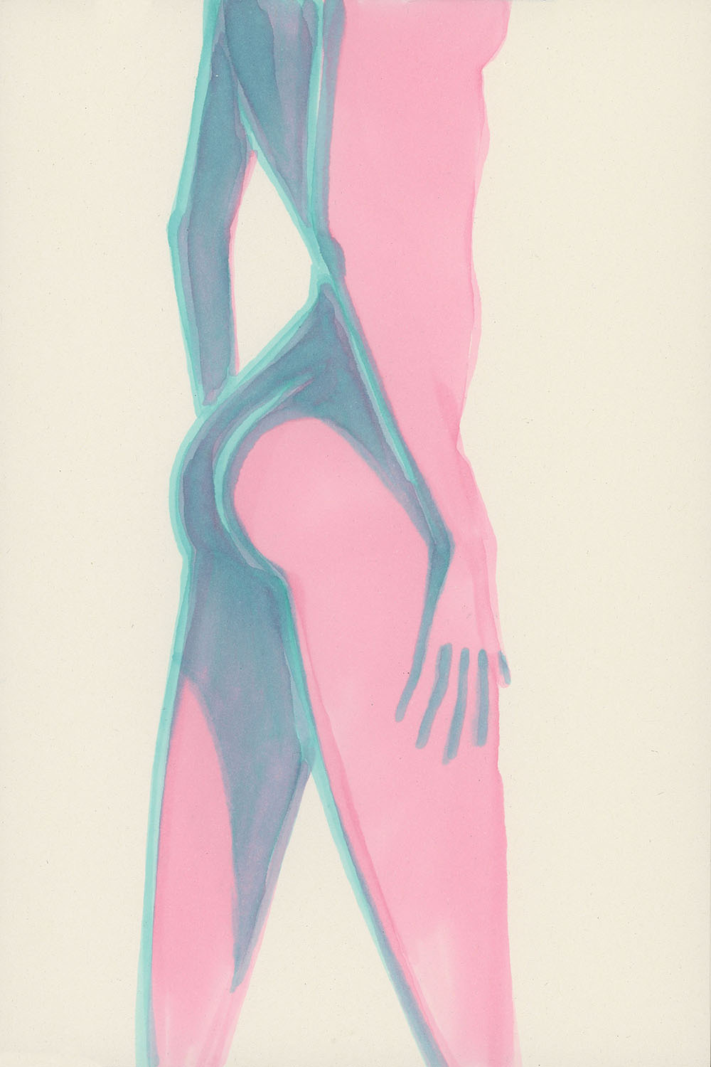
I want to try to illustrate the majesty of a sunset through the shapes of a woman, using two colors: one to express softness, and a pale, gentle blue for the feathers and the reflections.
MATERIALS
As usual, I use very simple materials — the kind you can find in any art supply store around the world.
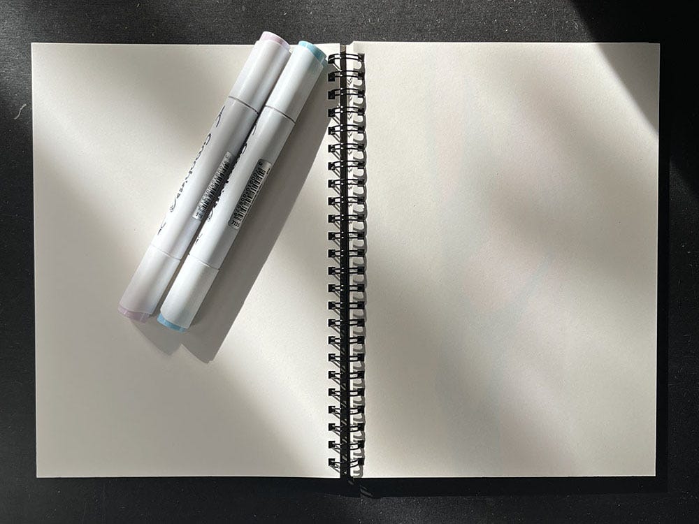
Here, I’ve chosen a small sketchbook (14 x 21 cm) with thin recycled paper. This one is from Muji but you can similar ones in your favorite art store. I like the smooth texture and creamy tone of the pages.
For the markers, here are the references I used:
Pale Pink — Graph’It 7220 brush marker, or Winsor & Newton Promarker Brush Satin
Pale Blue — Graph’It 5115 brush marker, or Winsor & Newton Promarker Brush Cool Aqua or C528

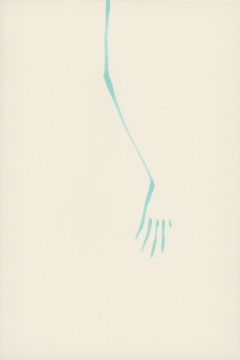
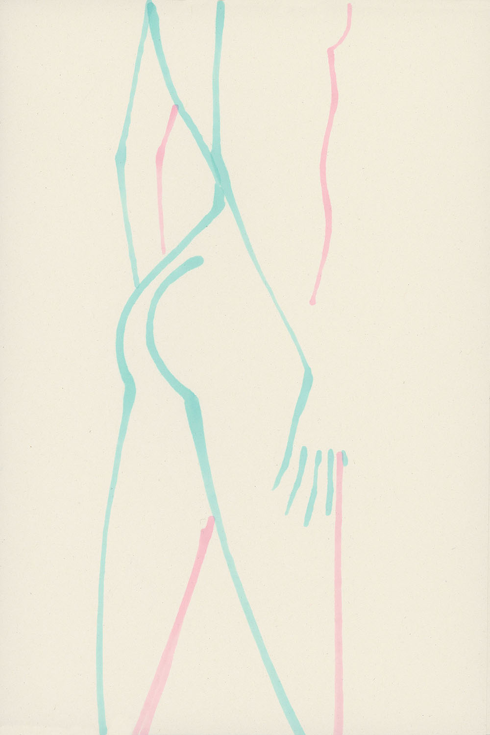
STEP 1
I start with the pale blue marker to draw the first arm in the foreground. It’s important to already have in mind the size and placement of the rest of the figure on the page. I begin at the top and work my way down, shaping the angle of the elbow, then adding a few small strokes to suggest the shadows of the fingers. I add a short line for the thumb. I use the flexibility of the brush tip to vary my lines subtly, without overdoing it.
STEP 2
Still using the pale blue marker, I move on straight away to sketch the curve of the back. Depending on how clearly I visualize the shoulders, I might start at the top or begin with the curve of the hip. Choose what works best for your understanding of anatomy. I often go in the same direction as in the first step — top to bottom. This time, I go all the way down and place the flow of the thigh.

STEP 3
I immediately draw the second leg, starting from the other hip. Then I drop down into the leg, giving it the right angle to suggest movement, in alignment with the hand resting on it.
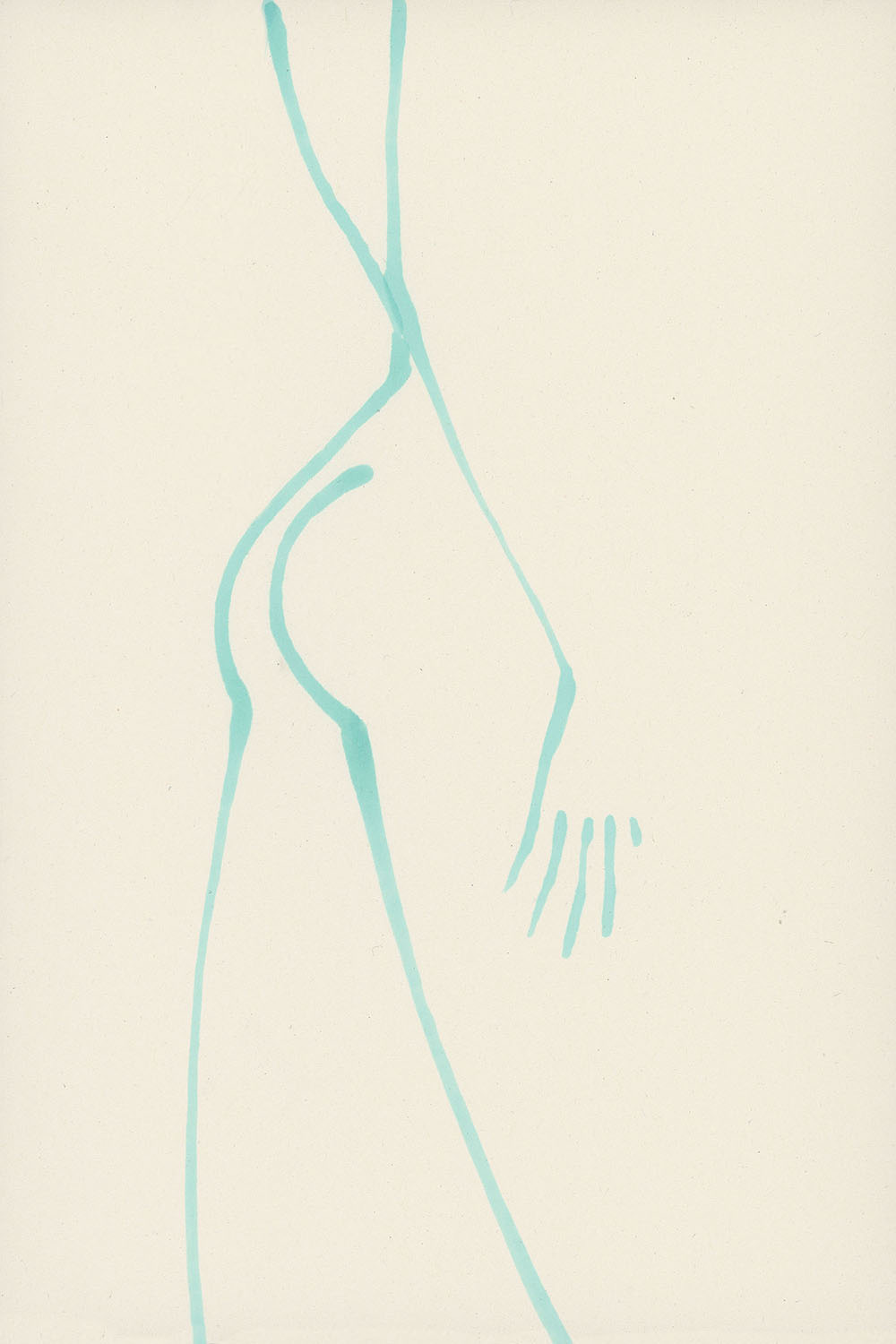
STEP 4
Now I can place the arm in the background. I make sure that the elbow angle is consistent with the first arm. I could stop here.
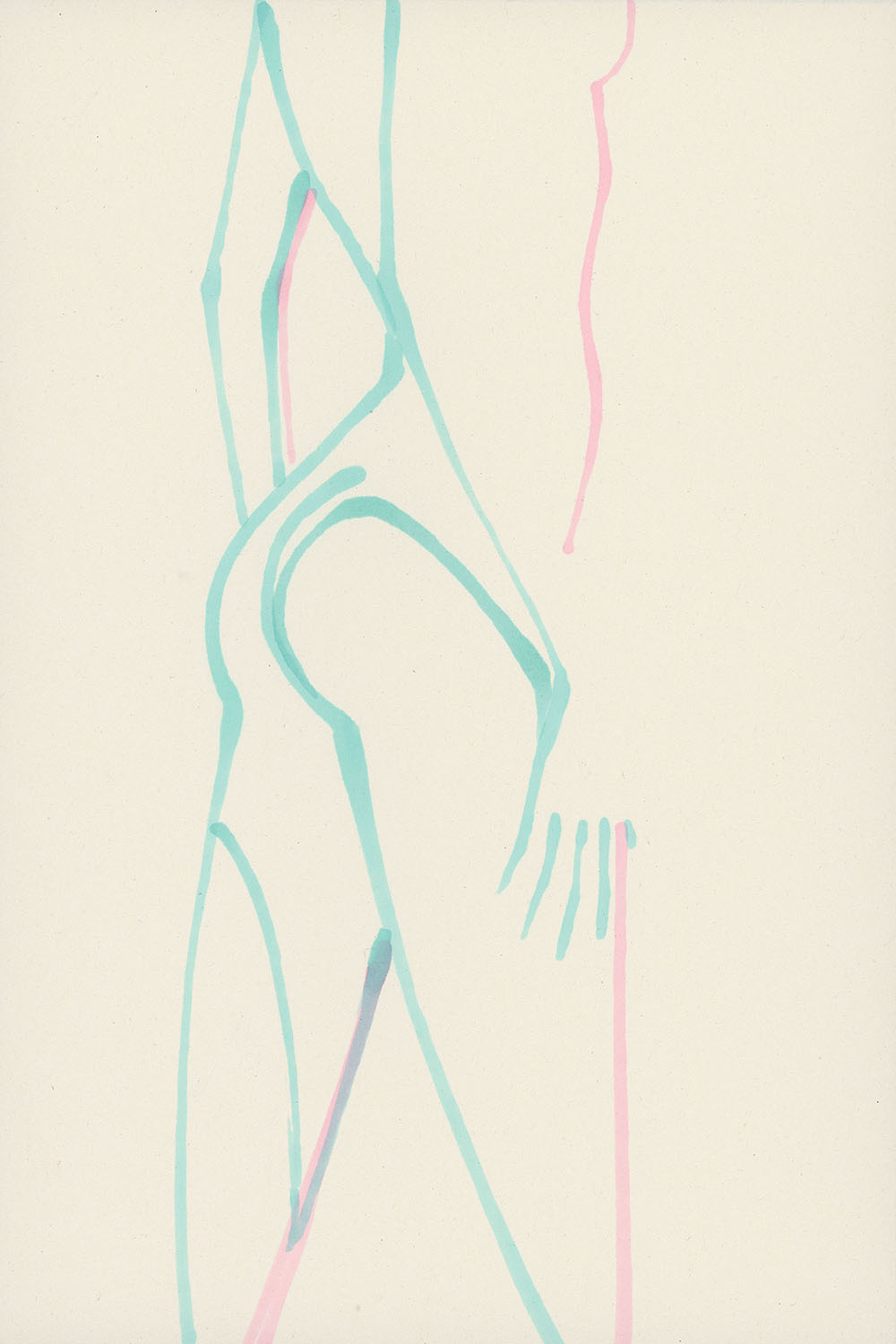
STEP 5
I decide to continue using the pale pink to place the contours of the silhouette and the light coming from the right. These lines serve as markers between the viewer’s eye and the body emerging on the page.
I really enjoy this step because it already gives a glimpse of what’s to come. Some of you might feel like stopping here — and I understand that completely. In fact, this stage is quite decisive, because it’s when you realize whether your structure is solid or, at the very least, feels right to you.
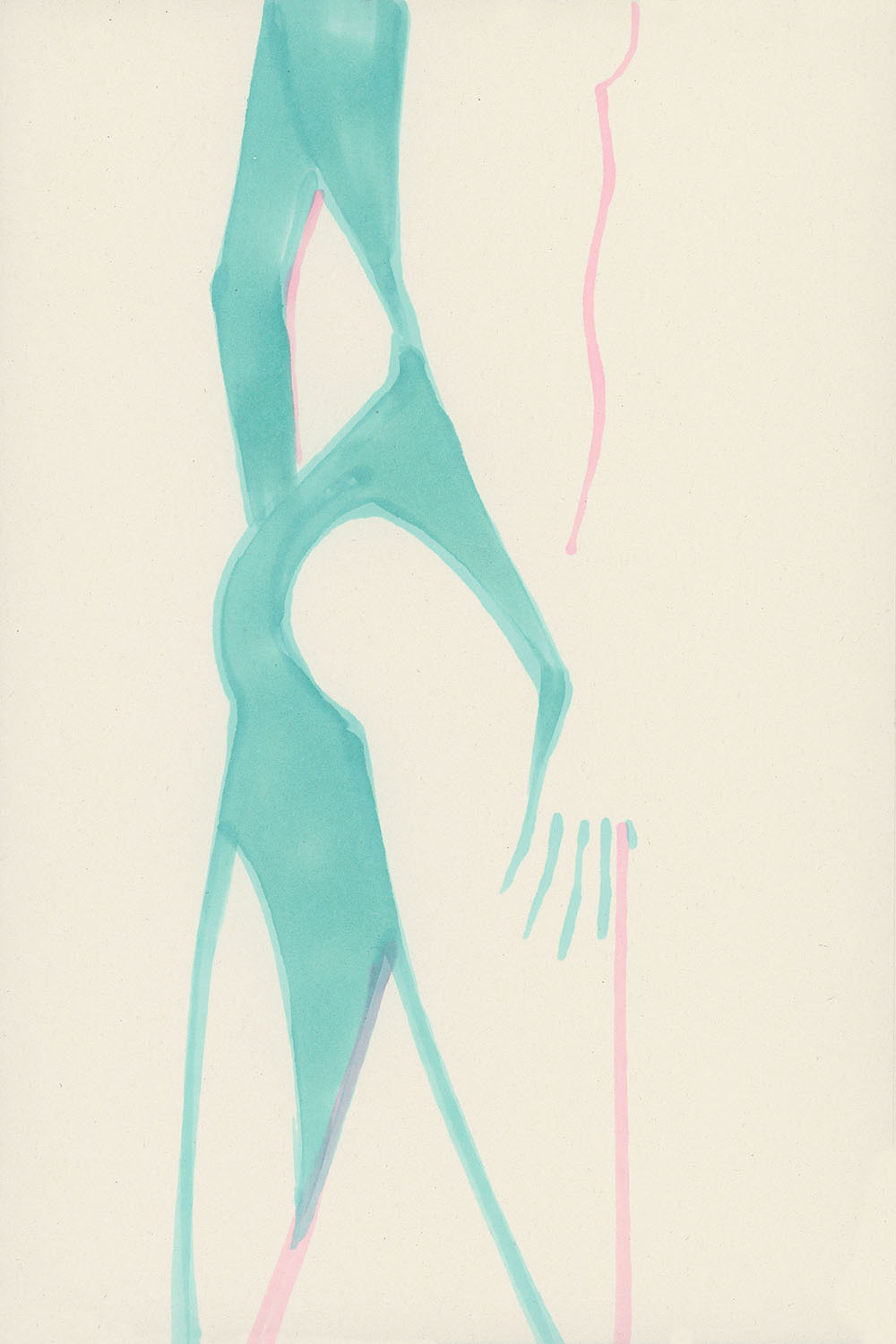
STEP 6
To mark the areas of blue light and shadow, I go back in with the blue marker and define the outlines that seem consistent. I offset them slightly, because I’ll need that space to preserve areas of contrast and light.
STEP 7
I fill in quickly, letting the ink create its own textures and accidental stains. I embrace the randomness of how the marker spreads.
STEP 8
I go back to the pale pink marker and repeat the same logic as in step 6. You’ll begin to see how the blue areas remain visible — these are the parts where the two tones will eventually overlap.
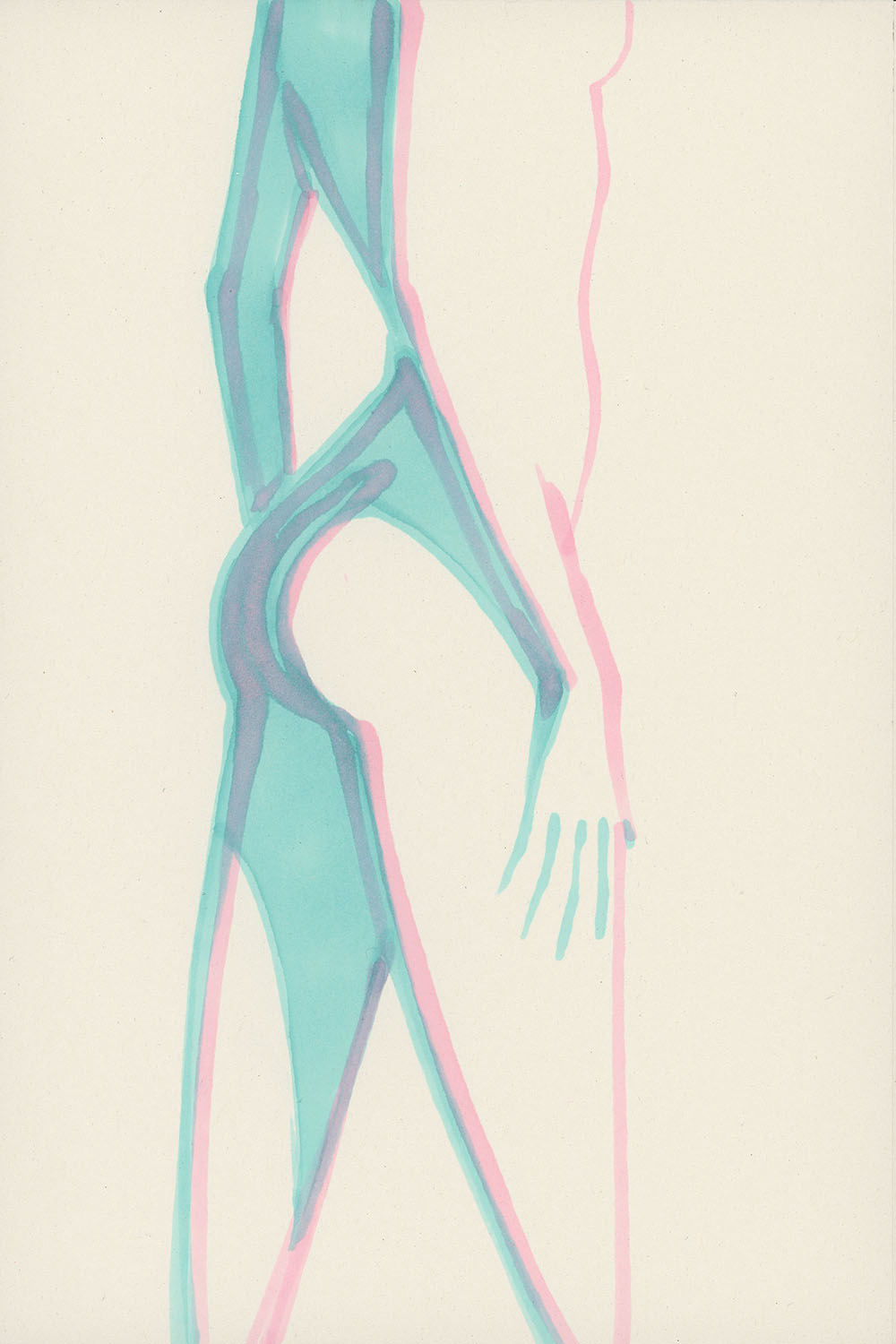
STEP 9
I fill in more or less quickly — finding the right speed somewhere between achieving a flat, even tone and allowing surprises from the ink.
What really matters here is the time between each layer and each overlap. The way the inks react can vary a lot — and you have to play with that. It’s the only way to gain control, or at least understand how the blending behaves.
In this drawing, I also added more blue in the darker areas to contrast with the pink flat tones. I encourage you to try that too.
I hope you enjoyed this first page of Process as much as I enjoyed sharing it with you.
These step-by-step images feel like the perfect way to clearly understand the process and the sequence needed to reach this result.
Sometimes there will be video versions, and other times I’ll suggest alternative interpretations at the end.